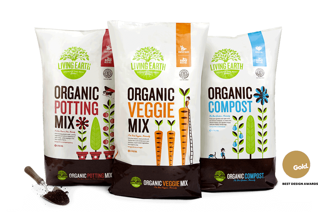
LIVING EARTH IDENTITY & PACKAGING
Living Earth are the compost connoisseurs. Because of Fracture's renegade reputation they approached us to give their brand a bit of a shake up. We got the design party started by modernising their existing logo, and then sorted all their products into two clearly defined ranges - Organic, and the fertiliser-enhanced range "More Than". With their packaging, we saw a great opportunity to do something radically different.
Our aim was to show "high performance" in a natural and recycled way, rather than the typical high tech or high-octane approach. Our concept was a series of illustrated stories about characters trying to contend with the fairy-tale growth of gigantic plants, appealing to both longtime gardeners and those new to the scene. The packaging went on to receive a Gold Award at NZ's prestigious Best Awards in 2012. We'd like to thank our mums...


